Showing posts with label G321 Thriller Research. Show all posts

Friday, 5 April 2013

Conventions of Film Noir

This is a piece of research where we looked at different noir movies and commented on the shot types/angles, costume, lighting, mise en scene, etc.


Wednesday, 13 February 2013

Possible Fonts

A range of fonts are used within thrillers varying from: bold, helvetica, arial etc. The chosen font can help identify the style of the movie, what genre the movie may be and even how the movie is going to fair (an awful font will ruin the movie at the outset). For example, Noir movies all have the same big, bold, defined font that when used instantly labels the movie to have the conventions of every stereotypical noir movie out there. For example in 2012, an advert was televised for a new movie 'Gangster Squad' and instantly from the font that was shown in the titles, without any of the action following you could identify it was a modern noir making. I have drawn a couple of examples from leading thrillers below to compare and take notes from for choosing the font for my own thriller.

In most of the titles (apart from 'The Impossible' and 'Da Vinci Code') the writing is styled in big, bold, clear lettering. This is effective in that it's not  making you focus more on the colours around it and the actions that may be going on, it's standing out among all these different aspects to the mise en scene and giving a clear, bold statement of the movie title. This in effect will make the audience remember the name as t's been brought out as clear as day for them to see. The two alternatives of more styled writing from 'The Impossible' and 'DaVinci Code' is used due to two things: 1. One of them is already an acclaimed novel and therefore the same font that was used on the book has been replicated for the motion picture and 2. The Impossible is based on true, gripping events that shook the world. In accordance to the movies, the title is perfect. However, these thrillers also differ from others because it has a harsh reality to the plot, and one that maybe has a deeper meaning, hense why the styled writing may work better.
In relation to colour codes, the colours used are all quite dark and dim. This is showing the events that may come in this movie isn't going to be the nicest. For 'The Dark Knight Rises' we already know the ins and outs of the storyline as it is one of many batman movies made over the many years. However, the use of black replicates the bat that the whole movies originated and focus around. By making a relation to the colours used and the characters, this creates a logo in which audiences can relate the movie too. 'The Impossible', contrastingly uses the opposite effect of black writing and a white background. This could be used for the harsh reality that the film portrays, the black and white represents the good and bad and by using the white in the background it forsees that the movie will have a happy ending, or as happy as you can get from a tsunami.

For my own thriller, the style of font is inspired very much like 'The Bourne Ultimatum' just as some of the filming techniques and ideas also originated from. It's a very classic font, simple, however when contrasted against a dark background the writing will become very sharp and defined and one that will catch the viewers eye. With the help of dafont.com I have chosen a few samples for the title of the movie as well as the credits to use within the thriller. Each have their strengths and weaknesses however there is a definite style that has occured through the process.


1. This is a font called 'Mouse Deco' by Steve Ferrera. It is bold, simple with the noir edge to it, with the styling of the B and the R in particular. A reason why we may end up not choosing this font is because of that noir style it brings to it, as by using this it could contrast a lot with the plot of the story. Also this font suggests a 1930's/40's style about it and our thriller is very much set in modern day society and therefore wouldn't fit right with it. However, I do like the tall, lean style of the writing and would look to use something similair but maybe with a less styled effect.

 
2. This font is called 'Belgrad' by Vinzent Britz. This, just as the previous font I showcased is very tall and bold which I like about it. The spacing between the letters in this font I don't like as much as the one before as it had a lot more space between and doesn't fit well with our thriller. I think with tight spacing we could use it for a metaphor for Edward and the tight awkward situation he is facing, and with close letters, it also gives the image of everything being very claustrophobic and tight. This will then be accompanied by the thrillers shots. The issue with the style on the B and R have occured again, however this one is very much mroe dramatised than the previous shown. This doesn't really fit with the thriller as like I said before, we aren't looking for a classic, vintage look; we are looking for a clear, plain, modern look that can compliment the characters and story that it's describing.


3. This font is called 'Bebas' by Flat-It. This font is not very different from the previous two however it does have some recognisable features that differentiate. The first, the spacing is very much closer than the other two, and I like this because it makes the writing look claustrophobic, in a metaphorical sense ofcourse. However, I would like the writing that we use to be closer together than this but ofcourse we can tweek if necessary. This font is very simple with the B and the R not styled in the slightest. This is giving a modern look and not styled like the previous two which suit the characters as well as the footage we have used. This would (if used) be used for the title of the thriller due to the spacing issues. As this is introducing the movie it is essential that it is perfect and giving the image of what we are looking for. This font will be put against the thriller to test and see whether this will work well with the contrasted background we were hoping to put it against.


4. This font is called 'Tall Dark and Handsome' by QuickStick. This is a suitable font for the thriller as it has all the aspects which we were looking for: Tall, letters spaced close together, no styling on the letters, simple, effective against a contrasting background. The only difficulty with this font that I would find is that the boxing on the B and the R doesn't look quite right, and I would want it to be more rounded as it seems more simple that way. The boxing makes it look like it should belong to a science fiction movie rather than a thriller. However the height of the letters works well with the spacing, they compliment each other to make the word seem quite overpowering and looming, with this sense of claustrophobia with the letters being so close together. This could be related to Edward, and even to Barry (the other character) in a sense that Barry is looming over Edward and watching his every move, whilst closing in on him at every second getting closer and closer creating this claustrophobic effect i've been talking about.

Tuesday, 1 January 2013

Analysis of Psychological thriller - What is the lasting impression created on the viewer?

Psychological films in general are there to make an impression. They're the films that focus on the in depth details that get your thought process in a muddle, and really impact the way that you look at things. The thriller genre in general isn't really one to make you stop and think, it's primary purpose is more to entertain and, well, thrill. However as we delve into the sub genres of thrillers we can start to decifer the inter-textual outline of the secondary purpose. Looking into the sub genre of psychology  in thrillers we tread across films such as: Silence of the Lambs (1991), Fatal Attraction (1987), Memento (2000) and Taxi Driver (1976). Having seen psychological thrillers before, I wasn't that much affected by them, however after seeing a few (mostly made in the 20th century) I could conclude it's because I couldn't relate to them. I'm not sure that many people could relate to such thrills that were conjured up in these movies, however with a new century comes along new, fresh ideas that will cause more of an impact than before. The fact that people can now relate and understand the aspects of psychological thrillers make them seem a lot more real. The cross between fiction and non-fiction is misty through the eyes of a psychological movie as everything seems to be a lot more possible than before. Although always respecting the early made thrillers I have chosen to focus my time on  more recent psychological thriller. Chatroom.

Chatroom
Made in 2010, this british movie was distributed. This movie holds a rather gripping context and one in which a lot of people can relate. To give a bit of insight in what the movie is about, I have taken the synopsis from IMDB and the trailer to accompany it:
'When jaded teens Jim, Eva, Emily and Mo meet William online, they're seduced by his charisma. But William isn't what he seems. He's calculating and manipulative and doesn't have time for people in the real world. Jim is vulnerable and he has no idea how dangerous his new friendship with William will be. When Jim confesses he's on anti-depressants, William knows he's found a victim. he vows to help Jim off his drugs, and the rest of the group fall in line. What begins as friendly advice to help Jim becomes twisted and Eva and Mo realise the deadly game William's playing, but the wheels are in motion. Jim is set on a path of self-destruction, and is going to do the unthinkable. As Eva, Emily and Mo try to save Jim, William begins a terrifying game of cat and mouse chasing them across the internet, shutting down their systems, and cutting them off from his victim. Fantasy meets reality when William and Jim are face to face in rush hour on the underground. Without the faceless security of the online world, everything becomes real. It's now a race against time to save Jim, but the clock is ticking...and we fear someone must die.'


This movie's target audience seems to be for teenagers and young adults, in accordance to this it's for the people that can relate to it the most. For thirty, fourty years ago we didn't have the vast amount of technology that we do now, and chatrooms were that of a myth. However, in modern day society the amount of online chatrooms that almost anyone can get their way into, they've become dangerous. This film exploits the idea that, when in a chatroom, you can be whoever you want to be, and no one will ever find out because your identity can be as hidden as you want to be. To explore this further we must first look at the characters. 


Mise en scene

The mise en scene of this film is very clever. It takes the virtual world and then represents it with real life rooms and corridors. This enables every change they make into the blog change the room itself. The first images we are shown as the movie starts is this sequence where William is walking through a corridor of doors, looking for an empty room that he can make his death trap. This shot is repeatedly switched with a shot of him searching the web as we see this connection between the two representing each other. 
For example within this movie, William allows the girls to virtually decorate the chatroom and we are shown in real life as they make the room pink, with fluffy bunnies and balloons and confetti etc. This realisiation that the virtual world can cross into real life is a huge message being put across to the audience and really the representation of this is extroadinary as by watching the film we are being pulled into this view of the virtual world happening in real life. By seeing it so literal it really makes you think what we are saying online may not be so acceptable as if it were in real life.
Throughout the film, we are introduced to different rooms that offer different things to people. One room is a sex line where the character goes in to experience an older woman so that he can get his mind off of someone a bit younger. This sort of action clearly would not happen in real life, well, not in a respectable area anyway. The movie is objectifying what acceptable behaviour on the internet, clearly in real life is signified as anything less than wrong. However, the most disturbing and sick room that is shown within this movie is the one that will undoubtedly have the most affect upon any viewer. This room is the room that William takes Jim to. It's a room where someone convinces people to commit suicide by telling them that their life isn't worth living anymore and that instead of going on they should just end it whilst they're ahead. In a film, this is probably normal in the fact that weird and dangerous things happen, however when we step away from the fact that this is a film production and start to realise that this is echoing real life events, as rooms like this do exist virtually and do convince poor souls that they're worthless and they should take their lives. This, above everything else throughout the movie, personally affected me the most as I couldnt bare to think that a person could sit on an online chatroom and convince people to kill themselves. However, the shocking reality of this is that it does happen. By the use of a white room and quite empty room, the mise en scene decieves the audience by projecting this room as pure and angelic, however deeds that take place are far from this.


Monday, 10 December 2012

What do directors seek to establish in the opening of thrillers? (not finished)

During the opening of any movie, (no matter the: genre, style, type) every opening has to be interesting. It has to catch the viewers eye and make them went to find out what the character is about, or intrigued by what may happen with the couple etc. This is achieved in many different ways, however, focusing on the genre of thrillers? We see a rather different approach from say a romantic comedy. As thrillers are known for their exciting plots, complex story lines and in some cases exhilarating scenes, the opening of the movie is crucial in order to keep the viewers interested so that they can see the thrill unravel as the movie progresses. 

In the diagram below we see a colour code of how different thrillers establish different aspects for the opening of their movie, these aspects are: Establish the character, establish the themes, establish the location, establish the tone/mood, establish the plot and establish the genre. By using whichever one of these for the opening of the movie it also sets the theme for the rest of the movie.


On the right side we have a list of thrillers that I have mapped out against the diagram. As an example, the film I am going to use is China Town. This is represented with the orange line against the diagram. As we can see, being established within the opening of this movie more so than anything else is genre and plot. Then what seems equally matched we see tone/mood and location next on the scale and last but not least character and then theme. These are solely my opinion however from the outset of the movie we get a strong feel for the noir genre due to the different aspects being shown and already in the first few minutes we are introduced to an investigation opening the plot to the viewers. 
In comparison to China Town we have The Third Man. Now, where China Town lacks, The Third Man seems to gain. For, rather than establishing genre and plot it focuses more on theme and location and tone/mood. In some ways this is more effective in the means that in the opening we are introduced to an enigma about the movie as a whole. As we are given a snippet of what the movie will contain, however willing us to watch on as we want to figure out what the plot may/may not be. 

Example from a movie
The example that I am going to be using is that of Se7en. The director of this movie is called David Fincher and within this opening he plays close attention to introducing the characters and identifying their roles within the movie. As we can see in the graph above, Se7en is represented with the coloured line of biro blue. From a completely personal point of view, I have chosen to analytically put the three very highest as: establish the character, tone/mood and location. Leaving the lowest two as: establishing genre and plot.
The reasons for choosing the scale in which what was established are these. For a first, within the first few minutes of the film we are introduced to the main character, Detective Summerset (Morgan Freeman). We are introduced to a very lonely character, living alone in a simple apartment however in his line of work constantly being faced with danger. The phrase 'being surrounded by a group of people, yet feeling like you have no one' comes to mind. Everything about the way this character is presented is: controlled, precise, ordered, smart. This can be taken from the location in which he's shown, for everything in his house is perfectly in place, no mess. This is a very stereotypical view of any investigator however we are given the sense it's some what pushed further with this detective. In contrast to this old, stereotypical quite dated character near the end of the opening we are also introduced to quite a modern character. Dressed in quite a casual suit and with youth on his side, we are shown the up to date version of what investigators look and act like. By the way the young character interacts with Detective Sommerset we can only assume that he will play a big part in the movie.
In reference to the tone/mood of the opening already we can see a very serious side to the movie. From the tone of the characters voices, the way in which they act around each other and the situations they are faced with. From the very start where we see the seriousness of the murder case, with a dead, bloody body laying on the floor, quite a brutal tone is being set for the rest of the movie. With long, lingering shots we are left for seconds to really take in what is going on in the scene. This enables the shots to be more dramatic and really stick in our minds as to what is happening. In a scene where Detective Sommerset is sitting on his bed in the dark, he sets off a ticking counter to fall asleep to. We are then welcomed to a slow zoom, slowly focusing onto his face to end with a close up. This is portraying the mood as very miserable, lonely and making us feel very empathetic about his life.


Another Movie Example
Another movie I am going to use as an example is a thriller, with the sub genre of psychological. The movie I am referring to is 'The Cube' not a very recent film, made in 1997 however it holds a most intriguing opening. The rough guideline to what the movie is about is:
'Six Strangers awaken from their daily lives to find themselves trapped in a surreal prison - a seemingly endless maze of interlocking cubical chambers armed with lethal booby traps. None of these people knows why or how they were imprisoned... But it soon emerges that each of them has a skill that could contribute to their escape. Who created this diabolical maze, and why? There are unanswered questions on every side, whilst personality conflicts and struggles for power emerge as the tension rises. But one thing is crystal clear: unless they can learn to co-operate to work out the secrets of this deadly trap, none of them has very
 long to live.'


Below, we have the first 4 minutes of the film in which we are then taken to the title. The first thing we see is the eye of someone. An extreme close up to show the rather important action of someone waking up and seeming very disorientated. Already, we can see that whoever this person is isn't use to where they're being, setting a location and identifying the character. Just like se7en we are introduced to our first character straight away, although this one doesn't  last as long as Morgan Freeman. We see him laying down, very disorientated in unnatural surroundings and dressed in plain grey. From this we can sense that he may be some sort of convict? Or that he's been drugged and left in this place. As the story progresses my first thought of a convict is soon proven wrong.


The brightness of the location and the surrealism that shines through is one to make us think. It doesn't offer much for the sub genre neither does it tell us much about the theme or plot. However as the character starts to walk around and look into these hatches that seem to be doors, we are led into identical rooms as this however different colours. This is giving us a sense that it's some sort of maze with identical rooms surrounding each other. In the last room, we are welcomed to his untimely death, and in a rather gruesome way too. This helps us to establish the plot, as we are intrigues into uncovering that in order to survive the characters must find which rooms are safe and which may not be.

Monday, 26 November 2012

How do thriller movies use imagery to project the genre?

To describe how thrillers use their marketing imagery to sell the genre we must first know what it is that makes the thriller category. The dictionary definition of a thriller is: 'a novel, play, or movie with an exciting plot, typically involving crime or espionage.' So, being a thriller fanatic, the main concepts in which I may look for is: crime, espionage, or a rather intriguing plot. Now putting all of this into say a poster, is easier said than done. Trailers on the other hand seem a lot more plausible. But first let's look at the covers that will be published on buses, websites etc.


Above, are a collection of thriller covers. Although not all stereotypical we have a range from fantasy thrillers, to down and dirty thrillers. Although different movies nearly all have one thing in common (with the exception of 'The Thing' - bottom right) all of these covers use well known, rather famous characters on the front with anguished faces to promote the movie. With stars ranging from: Nicole Kidman, Nicholas Cage, Aaron Johnson and Angelina Jolie, with all these stars come a fan base. Now, these fan bases may not be used to thrillers, for Nicole Kidman is a stereotypical rom com movie queen, and therefore to then put her into a thriller, opens up a whole new relm for her fan base alone to explore. From this, they may choose to watch other thrillers as they liked Nicole in that movie, ultimately selling the thriller genre as well as increasing it's genre as a whole.

Another similarity between the covers are the colour scheme. In six of these covers we see the colour red being used on the titles. Red is stereotypically a colour associated with blood, death, horror and therefore being used for a thriller cover projects the association. Meaning the movie may contain certain horror aspects. This links in well with the definition (earlier used in the first paragraph) of thrillers having involved crime. Not only do they use the colour red, they also plaster it on a black backdrop to intensify the colour and really make the title stand out. This, as well as creating  a good image for the thriller genre is a great marketing technique as these will be posted on buildings and busses and to have such a striking title it will be one that will stick in the viewers mind.

Here we see the red writing across the black/dark backgrounds.

Most of these covers are also quite simple, with the exception of: Savages and Hunger Games being more complex. This intrigues people to want to see the thriller as they want to know more about it. Although simple, thrillers do tend to use stunning and effective images on the covers to create this surreal, strange backdrop for the title to be placed upon. A good example of stunning imagery on the cover is 'The Day the Earth Stood Still'. This movie was made in 1951 in the orignal version, and then remade again in 2008.
 In 1951 this was supposedly quite scary and a incredible thriller at that, however when remade in 2008 (due to the development of technology) we see the images a lot more surreal than before. With the use of big block capitals for the title, this is a title that won't be forgotten in a hurry. Already a well known title, this film already has some interest. However, it's the use of images that pull the audiences in. In the examples above we have alienated images, that strike the eyes. The use of colours with the black and lumionous blues and greens makes the images sharp and inviting. After the movie has been to the cinemas, we then get a dvd release and we see dvd covers use the same technique that we see in the posters. Keeping with 'The Day the Earth Stood Still' I have an example of the DVD cover:


 In the DVD cover we see the same techniques used as we did in the posters. For a first we have the same colour scheme as the others with the red writing across a black/dark background, making the writing stand out so when people skim read the back they take notice to the writing in red (supposedly the most important part). On the front cover we have familiar colours, the same used on the poster to promote the movie. This creates a familiar association to the movie, as people with reading disabilities can easily associate the colours and images to the movie. However, unlike the poster, on the DVD release we see the appearance of a famous actor (also the main character). This creates a visual recognition for people who may not have gone to see the movie at the cinemas. For they may see his face on the front cover and know that they've seen other films of his such as 'The Matrix' and want to see this movie because of it. 

Saturday, 24 November 2012

Linking Thrillers

Above, we have a map to show how different thrillers all inter-combine with each other. The movies I have chosen to use are: Casino Royale, Taken, Essex Boys, Batman, Spiderman, Law Abiding Citizen, Kill Bill, Layer Cake, Who Framed Roger Rabbit, Double Indemnity, L.A. Confidential, The Third Man, L.A. Noire and finally China Town. All of these are well known thrillers within the industry, some more famous than others however aspects of each linked with another. The features that I have chosen to associate the films with are: Voice overs, violence, femme fatale and deceit.
Although rather complicated to look at, this map is in fact quite simple. For, in the top right hand corner we have a key, explaining what colour lines mean, for example: purple = violence. Then from this, every movie that is placed on the purple line will involve violence within its content. 
This is a very easy way to compare thrillers together, for we can see what qualities they have in common, what they may differ from, to form quite a detailed analysis of thrillers in general. For example: from looking at the map we can see that the red line crosses with a lot of movies, we then look at they key and see that this is representing deceit, and so we can conclude that most thrillers have a key aspect of deceit in them.

Friday, 23 November 2012

Noir characteristics in 'Who framed Roger Rabbit'


Plot/Genre
Brief summary of plot: 'Toon star Roger is worried that his wife Jessica is playing pattycake with someone else, so the studio hires detective Eddie Valiant to snoop on her. But the stakes are quickly raised when Marvin Acme is found dead and Roger is prime suspect. Groundbreaking interaction between the live and animated characters, and lots of references to classic animation.'
The plot itself offers a lot for the noir genre, it includes: crime, deciept, investigators, thrill and ofcourse a dark twist. The dramatic and quite classic effect that is portrayed through combining the classic noir to classic animation is a complex contrast that keeps the movie from being a fatal disaster. Ofcourse, the animation is not noir in the slightest, however it is a fantastic comedy affect within the movie.
For the start of the the trailer we are shown an old and classic cartoon that many of us will relate to from our childhoods. Something about this keeps the sequence from being too much? (a little over dramatised maybe?) In my opinion it's the vintage scratches, and not quite high definition picture that we are all so used to nowadays, and although this is not a direct link to the noir genre, it does remind us of the time period it was made in. From this we are entered into the surreal world where the animation and the living, are habitated as one. The only real noir feature we can take from this, is the idea of disorientation. This is used quite effectively in noir movies to make the scene look more dramatic, frightening etc. However in this they use it to confuse you about what is real and what's not, for we have cartoon characters and real characters so how can we tell if what they're doing is real or not?


Costume
Following on from the cartoons, we are introduced to this glamorous fifties style life, (very noir) misconceding the brutal murder that is to take place within the story. We are introduced to the protagonists of the story (both male -very stereotypical for the time period for the men to be the heroes of the story and very noir in itself) in the form of a cartoon rabbit, and an investigator. The investigator is in the stereotypical bold hat, long coat, shirt, tie etc. oozing investigator. The personality of the investigator, although quite humorous, is that of a cold nature. He has no intention of helping Roger and quite forcefully tries to tell him no. This is very noir as it delves into the personality of what an investigator should be like: tough minded and not putting up with any un-needed business. However, quite unlike noir it does allow him to show a soft side throughout the movie, making the character more approachable and loveable in the eyes of the audience.
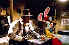
Not only do we have the rather striking costume of the investigator, we also have the stereotypical gangster look on the animated creatures (antagonists) and this is really exaggerated that they're the criminals as they're made to walk with arrogance, smoking a ciggarrette and talking like they own the place. The idea of being arrogant and the stereotypical dresswear echoes the noir genre very much so.


Setting/Surroundings
The settings/surroundings offer a lot of noir. For a first the desk that we see and well, frankly the whole office is very noir. The props used are those that are striking key features of a noir detectives desk, we have: lamp, pens, files, venetian blinds, books everywhere and all in all very messy. The only aspect missing is the artificial light, and with this? the scene would have been a perfect recollection of noir.


Other settings that are very stereotypically noir are: bar, crime scene, old warehouse, and artificially lit (creepy) street. These are all exaggerated in this movie painfully so that even the simplest of minds could understand what they're trying to portray. For example, in the crime scene we are shown with a white drawing of the where the body should be with a safe planted on the floor next to it. Not so noir. But keeping to it's comedy value, as this isn't all a serious movie after all.


In the bar scenes, we do see the aspect of dim/artificial lighting take place as the scene is meant to seem more sombre and mysterious. The usage of 50's style costume, dim lighting and props within the bar creates a brilliant scene in which to capture the story in.


Femme Fatale
The greatest of femme fatales and probably the most famous one in the animation history we are introduced to the great female character of Jessica Rabbit. At the start of the movie, the detective is hired to keep an eye on Jessica as she was seen to be an unfaithful wife, meddling with another man. Already we see a clear theme of deciept and power (all in her court ofcourse). She is a character that takes charge and gets her own way. This is a perfect example of femme fatale and a prime example of noir features. By using her wistful ways, and rather tempting figure, she flirts her way through the system, making any man believe what she wants them to believe. Although not killing anyone herself, and not being human, she could have quite easily replaced any femme fatale in a noir movie being a key seductress.


Choice of Main Character
The main character is that of Bob Hoskins. This actor was chosen particularly well as in the 1980's his career really set off with famous titles such as: The Long Good Friday (1980), The Cotton Club (1984) and Mona Lisa (1986) all in which Bob is playing the stereotypical gangster/investigator. With experience in this style of role, to recruit him into a noir style movie was a great investment. Not only this, but also stereotypical English movies, accents are part of his fortay, this is accentuated when he is made to do an american accent in Roger Rabbit. All in all, the very style of this film goes well with the experience of films that Bob Hoskins has had to play in the 80's.

The Long Good Friday PosterThe Cotton Club PosterMona Lisa Poster


Monday, 19 November 2012

How does LA Noire use features of Film Noir?


L.A. Noire is a play station game based on the stereotypical 'gangs of New York' with the person playing being the detective, and we are set out to investigate a number of different cases ranging from homicide, suicide, etc. Having had the chance to experience the game, the cases are quite intense and realistic and breach to be as life like as any cartoon can be. Above is a collage of images taken from the game to give a visual of what it contains.

In context with the noir genre, many of it's qualities overlap. For a start, with the opening credits of the video game we have this classic font, very simple and effective. This also promotes this sort of glamorous lifestyle, (noir glamour) and this is closely followed by an introduction of the game. Below is a clip of the opening to the game:

Here we have a classic noir opening. The 50's setting, costume and music all intertwine with some expressionist jazz to create a glamorous lifestyle for all to ponder and dream of having. This comes with the brutal reality of the gangsters involved in the game, and the horrific cases involved. This is portraying the noir theory that being a gangster is almost glamorous in itself and something to look up to and almost praise rather than be afraid of. As well as this, we have a narrative device in the form of a husky voice over explaining the story we have another classic noir trait. Along with this we are fed the line: 'Who do you trust' with a very melancholy voice, giving a dark twist to the almost light mood that they've been portraying so far.

Moving away from the opening and more into the game itself we start to unwrap more features that are quite strikingly alike to the noir genre. First, we are introduced to the investigators desk where we are shown a number of props, these include: gun, magnifying glass, folders, cigarettes etc. This is a stereotypical desk for any investigator in America and also very stereotypical for a noir investigator. Not only this, but many of the landscapes/settings used are spoiled with noir features, leaking this image of filthy, dirty and dark surroundings with: dim lighting, heavy shadows all topped off with a full moon to leave us with a lasting noir impression. We can see this by example in some of the pictures in the collage above. A great example of the dark shadows, is the top left where we see a man hiding around a corner with a very sharp shadow across his face creating moral ambiguity, also very noir.

Another similarity is that of the camera work. With the camera constantly moving, we are introduced to a very disorientated/eery effect within the scene, this only enhances the situation in which we are playing in. This is very noir as we have the dark story line, complimented by the shady camera work to make everything very confusing and surreal. Not only this but the camera movement uses the rule of thirds, keeping the characters to the points on the screen where our eyes are naturally drawn to.

This video game can closely relate to a rather famous noir film named 'The Third Man'. Like the Third Man, we see the use of torches to create a spotlight, paired with ambient and low key lighting. Most of the characters are also lighted from the back, creating an artificial effect commonly used in noir. In this clip, we have an example of the Third Man techniques used.  

From this clip I will be using the times from 0:00 - 5:33. The first indication that we see that it is using The Third Man techniques is the small claustrophobic space in which the character is entering in. We also see the use of artificial being made as a spotlight is drawn above the characters head. Not only this, but in true Third Man style, we have nearly an exact replica of a shot used in the movie:


Here we see a rather familiar surrounding and shot of the sewer that we see in the Third Man. By using this shot, to many noir loving fans, the connection can be made and the great atmosphere that was created in The Third Man with this shot can be echoed into the game.
Not only this but the constant use of the flash light from the character is quite commonly used in most noir movies, and especially in The Third Man. The action that's happening around the character with other contributing characters as well as the movement of the lighting and camera can also be closely related to The Third Man with specific analysis.

Wednesday, 14 November 2012

In 'The Third Man' sewer scene, how is claustrophobia and disorientation created?

Brief summary of The Third Man
The Third Man is a great example of a Noir film. It characterises all that is Noir with the stereotypical shadows, the dark story line, and so on. The plot to The Third Man is:
'An out of work pulp fiction novelist, Holly Martins, arrives in a post war Vienna divided into sectors by the victorious allies and where a shortage of supplies has lead to a flourishing black market. He arrives at the invitation of an ex-school friend, Harry Lime, who has offered him a job, only to discover that Lime has recently died in a peculiar traffic accident. From talking to Lime's friends and associates Martins soon notices that some of the stories are inconsistent, and determines to discover what really happened to Harry Lime.'  With actors such as: Joseph Cotten, Orson Welles and Alida Valli and a director of Carol Reed, it has a famous cast, making the film a popular success.

There are six different aspects in which the techniques can be categorised into, these are: sound, location, lighting, editing, camera and action. It's with these different aspects in which the atmosphere is dramatically controlled, and therefore can project the feeling of claustrophobia and disorientation towards the viewer. 
Below is the full video of the sewer scene taken from 'The Third Man': 


Sound
Sound is a very key aspect to the claustrophobia/disorientation effects that are being made in this scene. Sounds are constantly around us, and in this movie the dramatic extent to which they use this technique is to quite a phenomenon. The different sounds that we can distinguish from the clip are:
  • water running
  • banging/echoed voices
  • wind
  • feet pounding on the floor
  • German/English accents
For a first, when within the tunnel, the constant sounds of the crashing water from the waterfall surrounds the scene and over powers all other noises. Claustrophobia is created using this technique as the characters are metaphorically trapped by the sounds constantly around them, echoing off the not so distant walls, whilst creating the realism that running away from the sound is much more difficult than running from each other. This also accounts for disorientation as Harry (the man running from all the police) can't distinguish the water running to the men's voices, to the feet running with the water being so loud it drowns out the more important sounds that are more vital to his escape.
Disorientation is also made by the different accents being used. On the outside of the tunnel we here distinct German accents, calling for the police to go into different entrances to the sewers and then on the inside of the tunnels we here English accents. This contrast in different languages is enough to disorientate any normal person in a perfectly simple situation, so when you put the cross of dialect to a man running from police in a completely unknown setting? Then disorientation is quite obvious.

There is a great extract from the clip where Harry is near to freedom and his hand is stretching out from the drane. Here, all the other noises are cut from the scene and just the sound of wind blowing on his fingers is left lingering in the scene. This gives a sense of freedom to the character, although this freedom is short circuited . However, still enforcing the claustrophobia concept as his fingers are being squeezed through such a small space and such little of his fingers are being shown making it a very tight shot and the feeling of being very enclosed.

Another great extract from the scene is where harry is in the middle of the tunnel and is surrounded by different openings, one of which will be sure to lead him to freedom, however sounds are coming from every direction of people shouting and running and talking that either entrance could lead to a fatal disaster. Referring back to the video, this can be scene at the time of 6:19 minutes - 6:48 minutes. This is disorientating in itself, as each entrance brings another voice, as well as another accent, and of which entrance it's even coming from he's unsure of. The thought of the voices closing in on him also can bring about the claustrophobia concept.

Editing
Editing helps with the disorientating of the characters with the scene mentioned above in the sound section. Through the time of 6:19 minutes and 6:48 minutes the editing of the film helps to create the illusion that all of these people are saying these different things through different openings, making disorientation a key aspect.
Also, the constant changing of overground to underground shots makes the whole scene contrast. By showing the overground scene as very open and free, when they cut to the underground scene everything becomes a lot more enclosed and inevitable. 

Camera
The use of different angles and shot types within this sequence leads to a most intriguing sight. the first technique i'm going to be focusing on is the use of tight shots. All through the clip we see multiple characters in tight spaces, as the camera focuses in and makes everything seem claustrophobic. 

Above are a few examples of the tight shot I mentioned. In nearly all of these shots they are using a close up or mid shot. This in itself is used to show emotional responses, and in this situation using a mid shot just enhances the panic harry feels and the urgency the policeman feel to try and get this man. However, in the bottom left hand corner, they don't use a mid shot but yet use a long shot. Even though it's shot from further away it still gives the feeling of entrapment as it's only given a little space for the character to be seen in. This gives a sense of little space in the setting, enhancing the whole claustrophobia effect.

The next technique I'm drawing focus to is the movement of the camera. Throughout the scene the camera doesn't actually move, but stays still for the most of it. This allows the characters to run in and out of the shot. This doesn't create an effect of claustrophobia as such, but can make the viewer disorientated as we will see one group of policeman running in and out of the shot, to another group of policeman doing the same etc. and it may be hard to keep up with who we are watching, and in which direction they're all going. However, the camera does move at certain points, a rather abstract shot that is used is when Harry jumps onto a ladder. Here, they shoot it from almost a worms eye view and make a semi circle motion, swooping underneath him as he jumps onto the ladder. Almost imitating his movement with the camera. This is a very odd shot to use, however works fantastically with the disorientation concept as we're so used to the camera action being still and non-moving (well, with the odd slight movement) that when this is shown, the viewers are left baffled.

Another type of shot they use is a tilted shot. To the left is an example from the sequence. As you can see they used the tilted shot only so slightly, not enough for you to notice that something is somehow awkward about the setting, but enough for it to look unusual. With this slight tilt, it makes the shot disorientated in itself, and complimented with all the confusion of the action in which this shot is sandwiched with, disorientation is a major factor. 


Action
Throughout the sequence, the feeling that there is a lot going on all at once comes across very strongly. However, action wise? There really isn't much in variety to comment about. Although! It isn't about quantity, it's about quality and this video is packed with it! The main actions that we see throughout are:

  • Running
  • Shooting
  • Searching
  • Stopping and breathing
Although minimum amount of actions are used, they are used quite effectively. To create disorientation within the scene entrapment is used, this sense of trying to find a way of escaping and at each turn there seems to be less hope. Also, the aspect of trying to escape helps with the claustrophobia. For, to see a man constantly searching, in what seems to be such an open wide space can make it seem very small.
The searching of the character Harry compliments the action of the running, enhancing the agitated state in which the police and detective seem to be in not being able to find this one man among nearly a hundred policeman. As well as enhancing the disorientation, we can also use the searching action to compliment the claustrophobia effect. Elaborating on this idea, by using a lot of characters to search for one creates this image of lots of people in small spaces, therefore creating a claustrophobic effect.
 Lighting
Due to this being a noir style film, we can tell instantly that lighting will have a fantastic effect on the mood/atmosphere of the scene and ultimately adding to the disorientation/claustrophobia affects I'm discussing. First we notice that a lot of artificial light is being used from the torches of the policemen. This luminates a specific spot in the scene making the image seem fragmented and therefore disorientated. This effect can also make the illuminated image seem enclosed and quite tight, bringing in also the claustrophobia effect. An example of this is shown on the right. Here, we can see the flash light acts as a vanishing point, allowing us only to see the edges of the tunnel around the shaft of light that is at the opening of the tunnel. This makes the scene seem very claustrophobic as we can't see the whole surroundings, putting us out of our comfort zones. The aspect of the darkness makes our eyes strain, also putting us outside our comfort zone and therefore making us more disorientated as we try to focus on images in the dark.

Dark/dim lighting surrounds the images all the way through the sequence, creating dark shadows across the tunnel walls from the characters as well as shadows across the characters faces. In relevance to the shadows across the characters faces, this creates moral ambiguity within the scene as well as helping to disorientate us into who the character is. The deep/dark lighting (as well as being a key noir feature) makes us disorientated as our eyes are not capable of adjusting fast in the dark as quite obviously we live in the light of day, therefore (as mentioned above) the usage of the dark lighting and dark shadows confuses our eyes as we try to adjust. 


Above are some great examples of the use of shadows and lighting to create more of a claustrophobic state than disorientation. In the bottom two, we see the shadows line the walls of the tunnels only allowing us to see parts of the tunnel. This is claustrophobic as it gives a sense as in the walls may be closing in or getting smaller due to the lack of sight with them. In the middle picture on the top row, disorientation takes place as we're shown a shadow however we have no body to match it with, therefore it could be that of a policeman's, harry's etc.

Location
Finally, we come to the location/setting of the whole sequence. There are only two locations used, and these are: underground and overground. In the overground scenes we see the city life: the busy buildings, cars moving everywhere. To the contrast of the underground scene: the sewers, tunnels, water running etc. The switch from the open air and the freedom of being overground makes the sewers seem much more closed and trapped, really putting into place the claustrophobia. 
From left to right: Overground, Underground

Wednesday, 7 November 2012

Film Noir: Collage, German Expressionism, Aesthetics

German Expressionism
When studying the origins of such genres as horror and film noir, it is necessary to be aware of the influence of German Expressionism, a style of film making developed during the years in Germany, particularly in 1920's Berlin.

German expressionist movies tended to emphasise cinematography above plot and narrative (focusing on the images being shown rather than the words spoken); often very slowly paced, for example, they were generally beautifully photographed, and this visual clarity had a pronounced effect on later German cinema. Danish cinema in particular was seen as being hugely influential, both in terms if style (lighting, scenic design and camera placement) and content (urban setting, focus on the criminal underworld and designed to deliver visceral thrills).

Images from German Expressionist movies


German film, in common with that of other nations, started to become more of an 'art form' in the years after world war 1 but, although the film industry was booming, the Germans could not compete with huge American budgets. As such, directors such as Lang and Murnau experimented instead with light and shadow (leading to the chiaroscuro style of lighting (essentially very low-key lighting designed to emphasise extreme pockets of light and dark) which is possibly the key feature of film noir, and, as such, much neo-noir and, more generally, horror and crime genre film ever since). In keeping with the shadowy aesthetic, themes tend to be dark (something of tradition in German literature); crime, soulessness and, in general, the darker side of human nature are emphasised. The influence was driven forward when Nazis took control of Germany and many of the directors, cinematographers and so on who had crafted this style fled to America.

The texts most commonly used as examples of German Expressionism (or heavily influenced by it) are those by Fritz Lang 'Metropolis' (1972) and 'M' (1931).

Here is an example of German Expressionism, from the movie 'Nostferatu' by Murnau (1922).

Collage of images from the noir genre.


Style/Aesthetic look of Film Noir
Film noir offers a lot of aesthetic pleasing to the eyes, as it focuses more on the visual effects than anything else. It does this by effectively using shadows anywhere they can: the characters faces, buildings, walls, lamp posts, anywhere they can they create a shadow in the image. This creates enigma to the scene and adding mystery to the story line. The lighting throughout is quite dim, so that everything seems a lot more eery. A lot of artificial light is used in the mise-en-scene to make the image a lot more disfigured and disorientated, confusing the viewers. This compliments the mood of noir, as even from the name (the french word for black) it's a very dark, somber atmosphere in the movies, so dark lighting and misty shadows can draw out the unusual darkness that the genre is trying to put across.
An example of these visual effects is this image:

This uses dark/dim lighting to create a mysterious background for the character, then in the background we see the artificial light from the lamp posts (another common prop used in noir movies), then on the wall we see the classic shadow. However this time the shadow is quite sharp, this could mean that he's the only one there? As the rest of the shot is blurred out, making the character the main focus.